Learn one way to easily content such as text from an image using the content aware fill.
Showing posts with label Adobe Photoshop. Show all posts
Showing posts with label Adobe Photoshop. Show all posts
Tuesday, September 30, 2014
Photoshop Tip - How Remove unwanted object or text with Content Aware Fill
Learn one way to easily content such as text from an image using the content aware fill.
Monday, September 29, 2014
Photoshop Tip - How correct color Temperature (White Balance) with levels
Learn one way to easily correct the color temperature of an image using the black point eye dropper in a levels adjustment layer giving you more realistic and dynamic colors.
Wednesday, November 28, 2012
PPI vs DPI
In a nutshell, PPI (pixels per inch) and DPI
(dots per inch) are two ways to measure resolution and are very similar in how
they operate. Before saying anything more it's worth mentioning that many
people unknowingly refer to PPI as DPI so there’s plenty of room for confusion.
First lest talk about DPI. This is the number
of printer ink dots in an inch and more is better. It's totally independent of an
images number of pixels or ppi and is totally controlled by the printer. Some
printers can print at a higher DPI which in theory will make the individual
dots less visible and the overall print look smoother. If you remember the old
dot matrix printers they had a much lower DPI then most modern ink jet printers
and if you looked close, you could see space in-between the dots of ink.
In general, designers are more concerned with
PPI. Before I talk about that however, it’s worth mentioning a few things about
pixels.
·
The pixel is the
smallest unit that comprises an image. There is no such thing as a fraction of
a pixel (fun designer trivia).
·
PPI controls how large
or small the pixels are displayed. Say we have an image that is 1000 pixels
across by 1000 pixels down. You can zoom in and change each pixel's color
individually but how large or small it appears when printed is determined by
the pixels per inch. If you set the PPI to 10 pixels per inch, then your image
will print much larger (100 inches across and down) then if you set the ppi to
100 which would make the image print smaller (10 inches across and down). The
obvious effect of having larger pixels is that the larger they are, the move
visible they will be to the viewer and the blockier (more pixilated) the image
will appear.
What this means is you want enough pixels per
inch so that the viewer cannot identify them individually and you will get a nice
smooth image. Typically when working on something for print, designers will
work at 300 ppi. Anything higher then this is mostly just making your file
larger and at 300 ppi, even thin lines will render smoothly which is
particularly important if your image contains text. Most of the time for
standard printers you would have in a home or office setting, 150 ppi will be
plenty to make images without text appear smooth to the human eye.
Screen resolution is even less. You will often
hear that screen images are made or saved at 72 ppi. This is a bit of a myth as
the screen doesn’t really care about the image’s ppi setting. Where the 72 ppi
thing came from has more to do with how fonts display relative to their point
size when working in Photoshop but we’ll save discussion on that for another
time.:-)
How an image appears on your screen is
dependent on three things. First, each operating system such as Microsof
Windows, has a ppi setting (often 96 ppi). Sometimes this can be changed though
it rarely is and as you would expect, a higher ppi will make the
graphics/interface appear/render smaller. This is only part of the equation
though as I'm sure you are aware that each monitor can be a different size and
have a different setting for number of pixels it displays across and down. If
one monitor is a 21inch and another is a 15in and they bother have a screen
display of 1200x800 pixels, then images will look larger on the 21 inch
display. Finally most software programs that you would view an image in will
typically let you view it at various magnifications. So how an image looks on
the screen is very hard to predict.
What you need to know if you are making
graphics for the screen such when doing website design, is that the ppi you set
in Photoshop means nothing. All that matters is the number of pixels across and
down on the image. So you would figure out what size most people will be
viewing the image at and try to make your image a set number of pixels that does
not exceed that and also won't look too small on it either. Understand that you
can change the ppi to 1 million and that won't affect the size of the image in
a web browser at all (provided you don't have the box checked to resample/scale
the image’s pixels in Photoshop).
In summary, it might be helpful to think of
ppi and dpi by comparing it to tv’s and the content we play on them. Think
about it this way. An old tv show (low res/ppi) viewed on a high def tv (high
res/dpi) will still look crappy. On the flip side a high def show (high ppi)
will only look as good as the tv it's on. So when printing an image, you still
want to be able to print it at 300 ppi ideall. Really good printers (high dpi)
will use all those pixels while lower res printers (low dpi) might not. So in a
nutshell, if your working on something that will be printed, it’s best to start
out working at 300 ppi and not bother worrying about the printers dpi. And if
you are working on something for the web, don’t even bother worrying about
either.
Thursday, August 30, 2012
Photoshop Tip - Change Color of object in a photo using Hue Adjustment Layer
Friday, August 24, 2012
Photoshop Tip - How to add a border to a photo
Thursday, February 23, 2012
PNG formats: 32-bit, 24-bit or 8-bit
I recently found myself scratching my head trying to figure out the different PNG formats found in Photoshop and Fireworks. Photoshop has two options: PNG-24 and PNG-8. Fireworks on the other hand appears to have these plus an additional option called PNG 32. So are Fireworks 32-bit PNG files higher quality then Photoshop? Actually they are not.
The Photoshop PNG-24 and the Fireworks PNG 32 are pretty much the same thing only labeled differently. It's confusing especially since both programs are Adobe products so you would think they would use the same naming conventions. In any case, the difference is in how they refer to the alpha channel which gives the file trancparency. The 8 extra bits in Fireworks PNG 32 fies represent the alpha channel so these files is really 24bit color with an 8bit alpha channel. This is why when you select PNG 24 in Fireworks there is no option to use trancparency. Photoshop on the other hand uses the PNG-24 label to refer to both transparent and non-tranparent PNGs and instead of calling the two different names, just has a checkbox to turn the alpha channel on or off. So in the end it's the same thing just two different ways of presenting it.
Where Fireworks has the upper hand is actually on the smaller PNG files refered to as PNG 8. Unlike Photoshop, Fireworks offers two types of tranceparency for PNG 8: Index Transparency and Alpha Transparency. Think of Index Transparency like the old tranparent Gif files that had the rough edges while the Alpha Transparency is more like what you would see in a higher quality PNG file. The real difference is that Alpha Trancparency supports semi tranparent objects and colors while Index Tranceparency shows pixels as either fully transparent or fully opaque. Unfortunately Photoshop does not offer this option so for 8-bit PNGs making Fireworks the obvious choise in this area.
One thing to note however is that not all graphics will look good compressed to 8-bit. In particular you want to be careful of large detailed photos and gradients (especially tranparent ones) which require more color information to display nicely. For icons and graphics with few colors, using 8-bit PNGs can greatly reduce the size of your web graphics so use it where you can but don't just compress all of your graphics and assume they will look perfect when rendered in the browser.
Thursday, February 16, 2012
Photoshop Quick Tip - Picking colors outside of the application with eyedropper
The Eyedropper tool in pretty straightforward to use. Simply move your mouse over the color you want to pick and click to select it. What's lesser known is that you are not restricted to clicking only on areas in the Photoshop window but you can actually pick a color from outside the application on any part of your screen. You'll notice that if you move your mouse outside of the Photoshop window that the eyedropper icon disappears. The trick is to first click somewhere in your Photoshop window and hold your mouse button down while dragging your pointer outside of the Photoshop. The eyedropper icon will will then remain and you can release the mouse button when you are over the color you wish to select. A simple but time-saving trick. One other thing to note is that this works in other similar applications such as Fireworks as well.
Friday, January 6, 2012
Photoshop Keyboard Shortcut: Changing brush size
I'll keep this Photoshop Tip brief. You can use the [ and ] keys to decrease or increase respectively the size of any Photoshop brush that you have selected. Just click on your Airbrush, Cloning Tool, Eraser etc an watch your cursor's circle brush size indicator change size as you press either of the bracket keys. Holding either one down will make it change quickly or you can just tap it to change the brush size incrementally. This is definitely one of the handiest shortcuts as you can see the brush size change while it is on top of the image which is much better and quicker then using the size slider. Have fun with it and watch how much faster you can work.
One side note is that there are instances where you won't see the circle brush size indicator. It is a preference that can be turned on or off but is usually on by default. Even when it's on however, I've run into instances (guessing they are memory related) where the brush size indicator doesn't show up and the only way to get it back is to restart Photoshop.
One side note is that there are instances where you won't see the circle brush size indicator. It is a preference that can be turned on or off but is usually on by default. Even when it's on however, I've run into instances (guessing they are memory related) where the brush size indicator doesn't show up and the only way to get it back is to restart Photoshop.
Tuesday, January 3, 2012
Creating PDFs that display mockups at actual size
Adobe Acrobat works great for sharing proofs for print projects but lets be honest. If you are creating mockups for a website or simply want to convert screen captures into a PDF, it can be quite frustrating. Doesn't matter if you use Photoshop, Fireworks or some other design program. Saving to, exporting or printing to a PDF is almost always sure to produce a blurry and noisy image. Also just as disturbing is the fact that Acrobat won't display the file at the same size as what you originally created it at but instead usually shows an enlarged version when you select 100% in Acrobat. Sure there are other ways to deliver mockups but the company I work for really prefers PDFs so I decided to figure out a reliable way to get a decent looking PDF of my site mockups. As I started researching for answers on the internet I was shocked at how little information there is on this. All I really wanted to do was have my PDF display muliple mockup images as pages at the same size and quality as if I exported them to PNGs...is that to much to ask?

The good news is it is possible and even better, it's not that difficult to do once you do some initial setup. In fact I'm shocked that Adobe hasn't addressed this themselves as their export to pdf option from Fireworks is pretty much worthless in my opinion. Enough of me venting though. Onto the solution.
First a summary of how this works. By default Adobe Acrobat has a Custom Resolution setting set at 110 pixels/inch (found under Edit>Preferences>Page Display). This needs to match the resolution of the files you create. Most designers that I know don't work at 110ppi but when working on something destined for the screen, the resolution really makes no difference (just the actual number of pixels). You could tell everyone who views your PDF to change their Acrobat Resolution setting to 72, 96 or whatever your ppi of choice is but the more obvious solution is to start working at the default 110 resolution to begin with. Trust me, it won't make your files larger or look any different as long as you don't change the actual number of pixels wide by tall. Very few people know or care that this setting exists in Acrobat so you can pretty much count on 110ppi being the setting on your clients system.
Alright now that you understand the resolution bit, let's move onto some settings in Adobe Acrobat. You will only have to set these up one time on your system. Open up Adobe Acrobat (of course you will need the full version...not just the viewer). Note that my directions and screen shots are for Adobe Acrobat 9 Pro but should be similar on other versions.

- Select Edit then Preferences
- Under Categories: click on Convert To PDF
- Under Converting To PDF click on PNG
- CLick the Edit Settings button
- Under Compression use the drop down by Color to select JPEG (Quality : Maximum)
- Click OK button to save and close Adobe PDF Settings
- Click OK button to save and close Preferences
What this does is tells the program that any time you use Acrobat to convert or combine color PNG files, you want it to compress them very little keeping most of the quality. Of course this makes for bigger file sizes but I prefer that then having a client become distracted by jpg noise which becomes more obvious in screen captures then it would in a photograph.

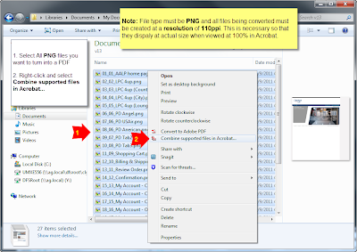
So now that you have Acrobat all setup, you should create or save out your 110ppi mockups as individual PNG files. It's also helpful if you number them sequentially. I usually export them all to a new folder where I can then select all of my PNG files that I want to combine into a PDF. Then I right-click the files and select Combine supported files in Acrobat..... Note that it also works to combine them in Adobe Acrobat once the program is open but this way just seems easier to me.

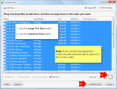
A Combine Files window opens in which you can reorder your files if desired. Once you have them ordered, click the Large File Size button found at the bottom right of the window (just above the Cancel button). Then click the Combine Files button and wait a few seconds while Acrobat converts the files into a single PDF.
You are now basically finished but there is one more step that I always make sure I do. With the newly combined PDF open...
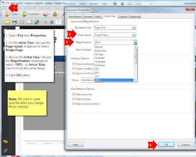
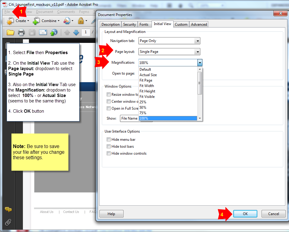
- Select File then Properties
- On the Initial View Tab use the Page layout: dropdown to select Single Page
- Also on the Initial View Tab use the Magnification: dropdown to select 100% - or Actual Size (seems to be the same thing)
- Click OK button
- Be sure to save your file after you change these settings
This forces the file to open up scaled to 100% so you can be very confident that your client will open the file and see exactly what they should expect to see on the finished website. It really does impact a client's perspective of a design if they are viewing it at a reduced or enlarged size so you want to be as accurate with this as possible.
And there you have it. Your PDF mockups have never looked so wonderful and depending on the number of pages and there size, you can can now create them in a matter of seconds for you client in a matter of seconds.
Subscribe to:
Posts (Atom)
