Showing posts with label Graphic Design. Show all posts

Tuesday, January 3, 2012

Creating PDFs that display mockups at actual size

Adobe Acrobat works great for sharing proofs for print projects but lets be honest. If you are creating mockups for a website or simply want to convert screen captures into a PDF, it can be quite frustrating. Doesn't matter if you use Photoshop, Fireworks or some other design program. Saving to, exporting or printing to a PDF is almost always sure to produce a blurry and noisy image. Also just as disturbing is the fact that Acrobat won't display the file at the same size as what you originally created it at but instead usually shows an enlarged version when you select 100% in Acrobat. Sure there are other ways to deliver mockups but the company I work for really prefers PDFs so I decided to figure out a reliable way to get a decent looking PDF of my site mockups. As I started researching for answers on the internet I was shocked at how little information there is on this. All I really wanted to do was have my PDF display muliple mockup images as pages at the same size and quality as if I exported them to PNGs...is that to much to ask?

The good news is it is possible and even better, it's not that difficult to do once you do some initial setup. In fact I'm shocked that Adobe hasn't addressed this themselves as their export to pdf option from Fireworks is pretty much worthless in my opinion. Enough of me venting though. Onto the solution.

First a summary of how this works. By default Adobe Acrobat has a Custom Resolution setting set at 110 pixels/inch (found under Edit>Preferences>Page Display). This needs to match the resolution of the files you create. Most designers that I know don't work at 110ppi but when working on something destined for the screen, the resolution really makes no difference (just the actual number of pixels). You could tell everyone who views your PDF to change their Acrobat Resolution setting to 72, 96 or whatever your ppi of choice is but the more obvious solution is to start working at the default 110 resolution to begin with. Trust me, it won't make your files larger or look any different as long as you don't change the actual number of pixels wide by tall. Very few people know or care that this setting exists in Acrobat so you can pretty much count on 110ppi being the setting on your clients system.

Alright now that you understand the resolution bit, let's move onto some settings in Adobe Acrobat. You will only have to set these up one time on your system. Open up Adobe Acrobat (of course you will need the full version...not just the viewer). Note that my directions and screen shots are for Adobe Acrobat 9 Pro but should be similar on other versions.


  1. Select Edit then Preferences
  2. Under Categories: click on Convert To PDF
  3. Under Converting To PDF click on PNG
  4. CLick the Edit Settings button
  5. Under Compression use the drop down by Color to select JPEG (Quality : Maximum)
  6. Click OK button to save and close Adobe PDF Settings
  7. Click OK button to save and close Preferences
What this does is tells the program that any time you use Acrobat to convert or combine color PNG files, you want it to compress them very little keeping most of the quality. Of course this makes for bigger file sizes but I prefer that then having a client become distracted by jpg noise which becomes more obvious in screen captures then it would in a photograph.


So now that you have Acrobat all setup, you should create or save out your 110ppi mockups as individual PNG files. It's also helpful if you number them sequentially. I usually export them all to a new folder where I can then select all of my PNG files that I want to combine into a PDF. Then I right-click the files and select Combine supported files in Acrobat..... Note that it also works to combine them in Adobe Acrobat once the program is open but this way just seems easier to me.


A Combine Files window opens in which you can reorder your files if desired. Once you have them ordered, click the Large File Size button found at the bottom right of the window (just above the Cancel button). Then click the Combine Files button and wait a few seconds while Acrobat converts the files into a single PDF.
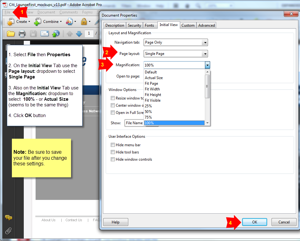


You are now basically finished but there is one more step that I always make sure I do. With the newly combined PDF open...
  1. Select File then Properties
  2. On the Initial View Tab use the Page layout: dropdown to select Single Page
  3. Also on the Initial View Tab use the Magnification: dropdown to select 100% - or Actual Size (seems to be the same thing)
  4. Click OK button
  5. Be sure to save your file after you change these settings
This forces the file to open up scaled to 100% so you can be very confident that your client will open the file and see exactly what they should expect to see on the finished website. It really does impact a client's perspective of a design if they are viewing it at a reduced or enlarged size so you want to be as accurate with this as possible.

And there you have it. Your PDF mockups have never looked so wonderful and depending on the number of pages and there size, you can can now create them in a matter of seconds for you client in a matter of seconds.

Friday, May 28, 2010


Learn one way to blur the background of an image in Photoshop while keeping the subject in focus using a duplicate layer, gaussian blur and a mask.

Monday, May 24, 2010

Photoshop Tip - How to make an image black and white with some color


Learn one way to make an image black and white with select areas still in full color in Photoshop using masking techniques.

Thursday, May 20, 2010

Photoshop Tip - How to convert a color image to black and white


Learn one way to convert a color image to black and white in Photoshop using a gradient map adjustment layer. Let me know in the comments if you have any questions.

Tuesday, May 18, 2010

Photoshop Tip - How to fade image to solid color


Learn one way to fade a photo image to a solid color in Photoshop using an adjustment layer and gradient mask. Let me know in the comments if you have any questions

"White Space" ending???

"White Space" or "Negative Space" is area in an image that surrounds an object. Good designs make this space come alive by making it as interesting as the objects themselves. Unfortunately white space in a blog isn't such a good thing. For quite some time now the space....ahem....time between blog entries has been negative (in a very unacceptably bad way). The good news is that new tips are coming soon (and I'm hoping to include video). I'll be starting to add new tips to once again enhance your productivity and creativity when using programs such as Photoshop, Illustrator and Flash. Let me know in the comments what subjects you'd like to see me cover and check back soon.

Thursday, June 26, 2008

Fonts: List of my favorites

Occasionally people will ask me what fonts they should use. My advice is to try to use well established fonts whenever possible. In fact in school one of my teachers really pushed us to only work with one or two fonts in all our projects for one semester. Frequently working with the same font really helps you discover it's strengths and weaknesses and helps you get a feel for what you can do with it. Now before I started seriously looking at becoming a designer I loved to use crazy decorative fonts and there are literally thousands of them out there. I thought they looked pretty cool at the time but now looking back at them I see that most of them were really quite hideous. They usually stand out from the design like a sore thumb and draw more attention to the font it self then to the message being delivered. Plus using in using these crazy fonts I tended to lean on them as a way to make the design look good. The truth of the matter is a good design will look pleasing to the eye with a very simple font. Of course there are the rare occasions where I end up using a decorative font here or there but they are pretty rare. I've listed the fonts I use most often on the side and they include: BaseNine, Baskerville, Bodoni, Caslon 540, City, Clarendon, DIN Engschrift, Franklin Gothic, Franklin Gothic Condensed, Futura, Garamond 3, Gill Sans, Helvetica Neue, Helvetica Neue Black, Helvetica Neue Condensed, Shelly Volante, Snell Roundhand, Times New Roman, Trajan and Verdana. There are other good fonts but if you stick with these time tested standards and try to avoid immediately grabbing the newest flashy font, your designs will look a lot more professional.

Tuesday, March 18, 2008

Keep it Simple

The most effective designs are usually very simple ones. One of my college teachers really drilled this into my head through the various exercises he had us do. When I'd show him a draft of a design he'd examine it and ask, "Do you think you really need this element? I think you already saying that with something else." Sometimes an extra graphic picture or effect just clutters the message. My teacher stressed that there was no need to say the same thing multiple times and doing so just clutters the design. An extreme example is if you were designing a poster for a concert and used lots of clipart of of music notes, instruments, piano keys and sheet music. Chances are you could communicate the same idea just as effectively with only one of those elements. In fact you might be able to communicate the idea more abstractly by making the typography and colors convey the feeling of music which would probably make it look more professional. The main idea is to focus on saying your message well and saying it only once. After all you wouldn't type the sentence "Come see a great band!" on the poster in the copy multiple times so don't do the same visually. Ask yourself what the bare minimum is that you need to convey the message and start experiment by dropping what isn't needed. This will take time and even courage to try removing things you've worked so hard on but will make your design more effective and easier to read in the end.

Thursday, March 6, 2008

Increasing Tracking (Letter Spacing)

One of the easiest ways to make text more readable is to increase the spacing between the letters. This is called changing the tracking and it will especially helps make small text easier to read. Just don’t get too carried away or people will start to read a word as individual letters :-) Basically increasing the tracking just gives the typography more room to breath on the page so it appears lighter and not so bunched up. This is an especially common effect used with type on TV or in films. Increasing letter spacing can also be a nice way to make a piece of text, such as a title, stand out similar to applying a bold or italic effect. Give it a try and see how much cleaner a paragraph or line of text can look by simply increasing the overall letter spacing.